
Flowcharts represent one of the most popular methods used for creating various diagrams. This option is very effective when you need to present a certain process. However, keep in mind that it can become more complicated when you need to introduce more data with one diagram. That is the main reason to learn more about flowcharts and how to create them properly.
The first thing to do is to determine what type of visual presentation you want to use. Also, you should choose the right software where it will be easier for you to add various data and make them more transparent. That is the main reason to look for a proper flowchart maker.
Also, this process requires certain skills and experience. Keep in mind that people in different areas are using this model in presentations, such as in finance, statistics, marketing, production, medicine, and more. Here are some tips and rules that will help you create more constructive and transparent visual presentations.
1. Don’t Experiment Too Much

Source:ucl.ac.uk
The great thing about many software options that you can use to create diagrams offers you various possibilities when it comes to design. However, the problem is that people often make a mistake by using flowcharts with too many different colors and shapes.
We understand that you wanted to highlight different types of information, but it is crucial to be sure that other people can understand the context of your presentation without too much effort. The best solution is to be consistent and select several colors that will represent different elements and use them for these elements all the time in the chart.
2. Pay Attention to the Size
The fact is that this is a very effective method when you want to introduce a process to a group of people. However, it would be a mistake if you create one that is too complicated. The complexity is often related to the size of the chart. When you introduce a presentation of some process that is too big, it can be easier for you to introduce it to the group.
However, if other people are going to use it on their own, it could become difficult to understand each part. In that matter, you should divide the chart into different categories or more pages to make it easier for people to follow the steps or processes you presented.
3. Structure Is Important
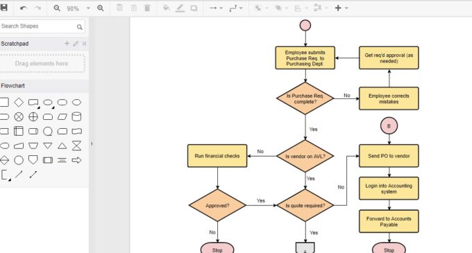
Source:online.visual-paradigm.com
As you can see, it is all about transparency and the ability to create a diagram that will make it easier for people to understand some processes. Therefore, there is no reason to introduce complex tables that could create additional issues. The simple solution is to select one model of the structure and use it throughout the whole chart. The most effective model is to show steps from left to right.
Besides that, the model you are using to show some process is important as well. There are two most common methods, splitting, and the standard model. When it comes to the standard model, be aware of certain issues that could occur since you will be using diamond shape for decisions.
First of all, you won’t be able to follow the steps from left to right, and you will need a lot more space to present a diagram. Also, it will be more complicated for others to understand it. Therefore, a much better solution is to use a simple approach, and boxes that are presenting a decision in one process will be much easier and more transparent.
Another important part of the diagram is return lines. It will be much easier for people to understand the process and follow the steps you presented when you are using simple visual options, left to right rules, and lines under the diagram.
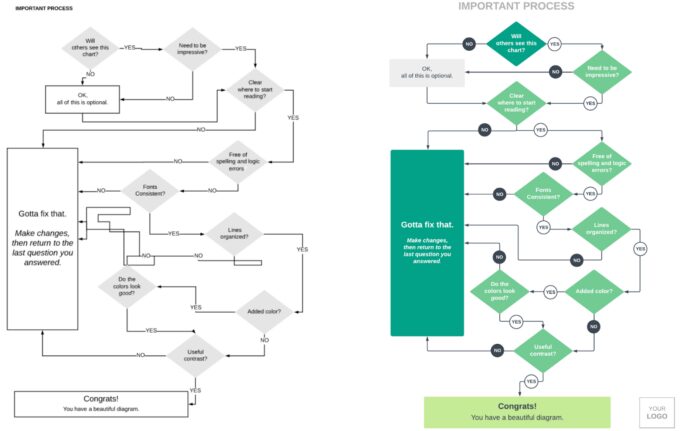
4. Compare It With Other Models
If you are not sure whether your diagram is going to be effective, the great option is that there are many charts available online. You should follow some rules applied for charts in the same area where you are working. The main advantage is that you can use this option to present a process to both new and existing workers in your company. Also, you can share it online so potential clients can learn more about the processes you are using. Therefore, it is crucial to focus on proper visibility and design.
5. Avoid Common Issues
As we already mentioned, the most common problem that you could face is related to the visibility of different steps and data. Also, if the chart is too complex, it can be difficult for people to follow it. That is the main reason why proper design can play an important role. When you determine the main elements and steps of some process, it is crucial to choose different colors for boxes representing them.
Besides that, you can use different sizes and shapes as well. Moreover, if you are planning to add other visual elements like pictures and animations, make sure that they won’t affect the visibility and usability of the chart.
Last Words
Source:lucidchart.com
It is important to understand the main reason why improving your skills in this area can be very important. There are many benefits when you introduce some process by using this model, such as much better communication, it will be easier for others to understand the steps, you can apply various elements, and save a lot of time.
On the other side, if you don’t have proper skills and experience, there could be some downsides as well. The common mistakes are charts that are too complex and don’t have proper rules related to boxes and colors, which makes it much harder for people to find certain information and follow the process.
That is the main reason to use a dedicated platform and learn more about some rules that will help you create an outline that will make it much easier for others to understand and follow the steps you introduced.